Tuesday, 13 January 2015

Here are some drawings from my reportage sketchbooks.

This image I created whilst at Hartlepool Marina. I decided to experiment by using a stick I found on the floor with ink to draw the distant building. I really enjoyed using something different to an ordinary tool, I think it works well with the single line drawing technique.

This is a drawing I created on the bus home from Uni. I liked using text within the piece, I wrote down part of a conversation I overheard on the bus, I find this added interest to the drawing. I like how the writing emerges from the ink. I would like to try and recreate this image in other media to see if it works well with perhaps a full colour pallet. 

Here are some examples of book binding I tried to see which I find most suitable for The Book of Drawings I will be producing.


This is the simple centre stitch book binding method. Below are instructions of how it was done.


Here is the Japanese stab binding book method, below are instructions of how I did this.


Here is the five hole pamphlet stitch book binding technique, below are instructions of how I did this.


This was from a image I drew in a lecture task reflecting of 'people of Britain'. I have never produced digital work before so this was a first for me, I enjoyed using the software and experimenting with the tools.


I prefer some of the digital work to other pieces I have created however in future I hope to become more familiar with the software producing better work.


This is a image of an area of the wall I drew for our installation group work. Our groups thoughts were to capture modern societys characters in a range of different styles. I wasnt happy with my work for this installment piece overall. I found my drawings slid into the background and werent very noticable.


This is a monoprint I produced of a life model we had. I like the brighness of the ink, this worked well to make the lines stand out. The simplicity of the piece works well for me, this was a quick posed piece and I tried to draw the main structure of the body as quicky as possible, I like how this looks once printed.


Animals


This illustration of the gorilla works really well. Although the piece is very simple and was just a quick sketch I think I captured the bold, strong body language of this animal. I used a combination of watercolour and compressed charcoal to create this and I like how the texture created by the charcoal works well to create a fur effect.


I created the drawing of these two birds using oil pastels. I find the bright colours worked well to capture the look of the tropical birds. Although feathers are smooth and the texture of the birds look quite rough, I like how the pastels could create a range of marks and how they would smudge into each other. To improve this I could perhaps try the same image with ink or watercolour to try and create a smoother appearance to replicate feathers.


Again here the image is very simplistic but I really like how I managed to capture this Blue Tit in motion quickly with few marks. I used watercolours to capture the lovely bright colours of the feathers and compressed charcoal to add features. I think these two materials work very well together.


Saturday, 10 January 2015

ARTISTS BOOKS

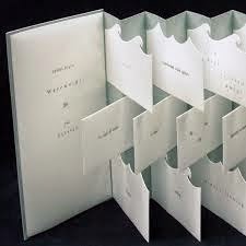
I used the internet to produce research into how I plan for my book to look. I gathered inspirational images of books that stood out to me for different reasons.


I want my book to have interest rather than just a simple book of drawings, I plan on using a variety of papers and media when producing my illustrations and possibly displaying them in a different way than your average 'left to right' book.


BOOK BINDING TECHNIQUES AND STYLES

What is book binding?

Bookbinding


From Wikipedia, the free encyclopedia
Bookbinding is the process of physically assembling a book from a number of folded or unfolded sheets of paper or other material. It usually involves attaching a book cover to the resulting text-block. Before the computer age, the bookbinding trade involved two divisions. First, there is stationery or vellum binding which deals with making new books intended to be written into, such as accounting ledgers, business journals, and guest log books, along with other general office stationery such as note books, manifold books, portfolios, and etc. Second is letterpress binding which deals with making new books intended to be read from and includes fine bindinglibrary binding, edition binding, and publisher's bindings.[1] A result of the new bindings is a third division dealing with the repair, restoration, and conservation of old used bindings. With the digital age, personal computers have replaced the pen and paper based accounting that used to drive most of the work in stationery binding. Today, modern bookbinding is divided between hand binding by individual craftsmen versus mass-produced bindings by high speed machines in a bindery factory.
(http://en.wikipedia.org/wiki/Bookbinding 4/12/14)
Great tutorial for envelope mini album Could be used for money envelope system.

Love this book binding

Book binding... this could be useful
( All above images from Pinterest 4/12/14)

(http://www.sophieartemispitt.com/page12.htm 4/12/14)


https://www.youtube.com/watch?v=ScupM_ULi8w

This YouTube video is a great tutorial of simple book binding..I particularly like the perspex added.

https://www.youtube.com/watch?v=rgwX8Qtsl2w

This video has a more simplistic appearance at the end.

Although I want the book itself to be interesting enough to provoke questions of how its made, I don't want the book binding to distract the viewer from my illustrations.
DIGITAL RESEARCH


(http://www.illustrationweb.com/artists/Gen/view 7/1/15)

This image has a magical feel to it. The surreal subject instantly captured my attention. The artist has used soft colours and different opacities creating layers of images, this gives depth to the piece and I beieve leads the viewer to really look into the work and all of its detail. The full composition works well here as the main strip of illustrations runs centrally through the piece yet still with more drawings surrounding the piece.

http://www.illustrationweb.com/artists/AlexandraBall/view 8/1/15)

This piece by Alexandra Ball has a warm, friendy feel to it. The curvatiousness of each line adds a soft, child friendly look to the piece. The running theme of wild animals closely shown with people within her work is mesmorising to me. Each shape has a different texture which gives the work a collage kind of feel.

http://www.illustrationweb.com/artists/FernandoJuarez/view

I love the fantastical subject of this piece. The illustrator hasnt made the work too busy which I think is effective as it draws the viewers eyes to the centre of the piece. The incorrect proportions of both the horse and girl work wonderfully and give the image a playful atmospheric feel.
http://www.illustrationweb.com/artists/ShangheeShin/view

This piece is extremely playful and colourful. The use of animals instead of humans and sweets making up the ice cream van gives the work a childfriendly aspect yet still appeaing to adults because of the humor within this piece.  The work has been created in a very surreal and exciting way which inspired me to 'look outside of the box'.