Wednesday, 7 January 2015

PEOPLE AND CHARACTERS RESEARCH

(http://www.illustrationweb.com/artists/HelenBullock/view 7/1/15)

I love the simplicity of this piece. The single line that is the outline isn't perfect, I like how the illustrator chose to do this - even though the piece isn't very  detailed I find it works well. The use of colour and thicker paint for the hair really brings the work to life.
(http://www.illustrationweb.com/artists/Gen/view 7/1/15)

This illustrator has an element of fragility and freshness in her work. The characters in this piece all seem to have fairly unique looks. The tones in this image give the piece a calm feel, each person is executed well expressing the attitude and emotion of the characters.


(http://www.illustrationweb.com/artists/stevenpattison/view 7/1/15)

The colours in this piece are amazing, I love how the illustrator hasn't used skin tones it gives the image a dramatic and exciting feel. The main features of this character are exaggerated and enlarged for example the eyebrows are very large in comparison to the eyes, this helps to show what the character really looks like. 

(http://www.envasarte.com/2011/02/adara-sanchez/ 7/1/15)

This is a piece by one of my favourite illustrators, Adara Sanchez. I find the arrangement of the random colours work well together, especially against the colouring of the line.The use of line drawing is really effective and captures the person well. I like the way the line is slightly indented into the textured paper.


(http://adarasanchez.tumblr.com/ 7/1/15)

This is another illustration by Sanchez. I love the looseness of the lines, the curvaceousness emphasizes femininity. I love how she leaves the structure lines in and doesn't mind if the colorful overlaps the line. I like how the opacity of the line varies, being bolder in shadowed areas. 


ANIMALS AND CREATURES RESEARCH

Illustration of Polar Bear Christmas Card
(http://www.illustrationweb.com/artists/KatharineAsher/all/29 6/1/15)

 This is the work of Katharine Asher. I think this painting of a polar bear is beautiful.I love how she has made the bear look so delicate due to the soft colours used. The way the colour has been applied so carefully really shows the texture of the fur. The detail in this piece makes it look life like.

(http://www.illustrationweb.com/artists/KatharineAsher/all/29 6/1/15)

This is another piece by Katherine Asher. I feel the simplicity in this piece creates a young feel to the piece which works well with the subject. I particularly like the scratchy lines used in the ink underneath the bird 


(http://www.illustrationweb.com/artists/JacquelineBissett/view 7/1/15)

This is a piece by Jacqueline Bissett. The monochrome aspect of this piece is very effective, I feel like it adds innocence to the piece and doesn't distract the viewer from the beauty of the drawings. Although you wouldn't naturally find these animals together like this I think the composition works well.


(http://www.illustrationweb.com/artists/MichaelFrith/view 7/1/15)

I love this illustration. The colours are amazing and the way that the media has been applied with a variety of marks really shows the texture of the crabs shell. This is an example of a piece where the colour is crucial, I don't feel it would create the same impacts if the piece had a limited colour pallet.


(http://www.illustrationweb.com/artists/LukasBischoff/view 7/1/15)

This illustration stood out to me, particularly because of the composition of the piece. Unlike the other images I have chosen, this doesn't show the full animal but I feel it works just as well. He has captured the animal and its personality in this image well, and I have been inspired to create works of my own that focus on a particular area of the animals body.

Tuesday, 6 January 2015


REPORTAGE RESEARCH


(http://www.gallerynucleus.com/artist/veronica_lawlor 5/1/15)

This is a piece by Veronica Lawlor. She is a reportage artist who loves working with fast movement. In this piece I feel she has captured the movement well which is shown by the detail and overlapping of lines creating intense areas of colour and marks. I like how the foreground has been left with just the outlines of the characters and the bold colours that grab the veiwers attention that promenantly run through the image. I find the contrast of the white spaces against the bold colours work well together neither overpowering the other.

matsue

(http://www.veronicalawlor.com/?p=440 5/1/2015)

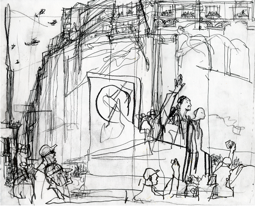
This piece is effective becuase of the ovberlapping of each line, within one persons head you see the building behind them as if everything has a translucency to it. I like how she leaves the main structure of the work visible, no lines are erased so its very clear to see how the piece was put together. I love the use of charcoal in this iumage and the combination of bold and fine lines, how busier areas are darker. I find it has more of  a hectic look than the previous image even though the colour is missing.

(http://prattcomd.com/faculty/eddie-pena/ 5/1/15)

I think this image is beautiful. I love the combination of the loose areas of ink against the precision that's shown in the lines of the drawing. even though the ink is quite strong against the delicacy of the lines, they work well together. I like the way he has worked out of the line hes drawn around the piece, there is a lot to look at but i find the piece still gives a calm overall atmospheric feel.

Gary Embury
(http://reportager.uwe.ac.uk/mempics/betza/betza3.htm 6/1/15)

I really like this piece by Greg Betza. When initially looking at the image its the bold Chinese writing that is the most striking but I love the more detailed areas underneath this of the people. I love how the whole drawing is created with ink but used in different ways, for example in its more concentrated form to create boldness then more finely to create detail and the areas where it has been dispersed.

Gary Embury
(http://reportager.uwe.ac.uk/mempics/betza/betza5.htm 6/1/15)
This is a really powerful piece by Greg Betza. The contrast between the blue, black and white has a very dramatic impact and I feel that the combination of media emphasizes this. The texture created with the pastels gives a rough feel to the piece and I feel it gives an industrial and dirty look to the image which is appropriate to the city/ building site subject of the work.